| At first glance, the cards look identical. Same picture, same text, white border, copyright 1995. However, the German Revised (on the left) is distinctly different than its German Fourth counterpart (on the right). |

|

|
|
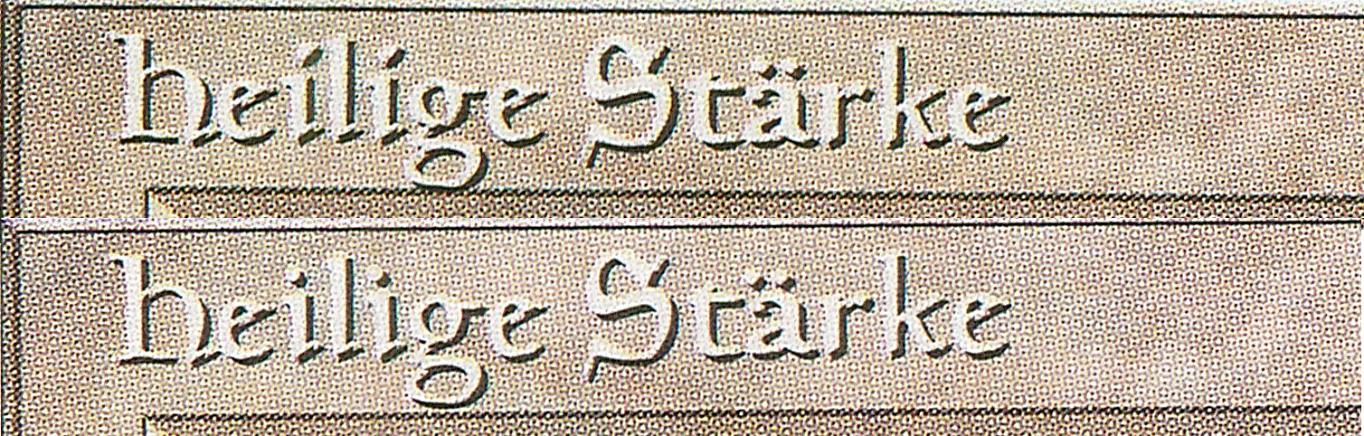
Ignoring for the moment the fact that Holy Strength can be identified by the i difference and the umlaut difference, looking at the titles at this resolution for other differences does not really help. Therefore, this is considered a difficult-to-spot difference. (German Revised on the top, German Fourth on the bottom). |
|
|
|
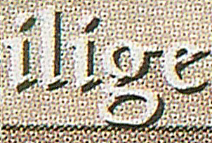
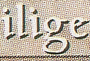
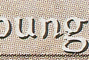
Here is a zoomed-in higher resolution (1200 ppi) scan of two Holy Strengths (German Revised on the top, German Fourth on the bottom). Still can't see it? |
|
|
|
How about now? It looks like the card designers raised the title text up just a few pixels in the German Fourth edition so the 'g' no longer rests on the card frame, but rather hovers slightly above it. |
|
|
|
Actually, there is no discernible difference on the front of the card, |
|
|
|
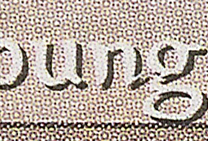
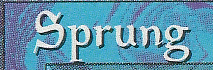
And a German Revised Jump, where both the 'p' and the 'g' are resting on the card frame... |
|
|
|
This difference in the position of the title between the two editions helps us distinguish 13 of the German Revised cards:
As you can see, for some unknown reason, the white cards seems to be overly represented in the g differences. There are a few more cards that have a 'g' or 'p' in the German name, but I do not own examples of them, so I cannot verify the difference:
|
||